19 Apr

True Colors

Posted in Art, Creativity, Design, Inspiration, Writing

As you might have noticed, I’m really into design.  A graphic designer and product manager in a past life, you could say I’m a little bit obsessed with clean lines and balanced designs.  I love problem-solving so that form and function work together seamlessly.  One of the areas that most fascinates me in design is color theory and color symbolism.  I find it remarkable that certain colors seem almost to have certain personalities or identities.  Much like characters in a story.

Colors and their meanings:

Certain colors have intrinsic meaning.  Red means “stop” or “warning.”  Orange is an attention-grabbing color, green suggests growth and life, and blue generally has a calming influence.  Even before we add the layers of other influences, these colors already have a certain symbolism inherent in the color itself.

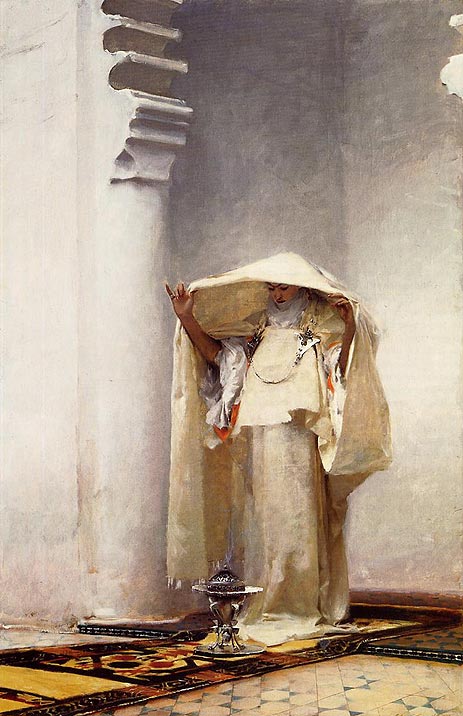
Traditions and cultures help shape symbolism.  In Western culture, the color white implies innocence and purity while in other cultures it is actually the color of mourning.  The phrase “green with envy” has added a different layer of meaning to the color.

Combining colors lends nuance.  Blue alone might symbolize peace and calm, but add red and yellow, and you get the primary colors which imply youth.  Replace the yellow with white and you get a patriotic color combination.  When you pair colors together, their meanings can change or acquire nuance.

A little color theory:

Red, Yellow and Blue are the primary colors.  They are called primary colors because you cannot mix any other colors together to get these three.

Note: red, yellow and blue are primary colors for pigment.  When you’re talking about color and light, the primaries are actually red, green and blue but that gets us into crazy physics stuff and I’m not going there.

Orange, Green and Purple are secondary colors.  They are called secondary because you can make them by mixing only two primaries.

See the color wheel below for primary and secondary colors.  Primaries are marked with a 1 and secondaries are marked with a 2.

Image Credit Tiger Color: Color Lab

Opposites provide good contrast.  Colors that are opposite each other on the color wheel are called complementary colors because they complement each other well and provide contrast.  Each of the primary colors has a secondary color as its complement.

But, what does this have to do with writing?

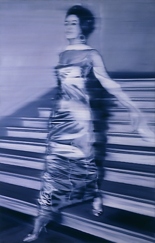
Color can set a mood.  It can inspire a feeling or set the tone for a piece of writing.  You can use individual colors or a color scheme to capture the essence of your story without words.  Think of it as a wordless summary.

Characters are like colors.  Often the best way to draw a character out is to pair it with someone completely opposite.  If your character is best represented by a shade of purple, try pairing her with someone who’s a yellow and watch the sparks fly.

How I use color: When I develop a new character with an acrostic bio card, I tape a paint chip to the back of the card.  The color becomes like a wordless bio for the character, telling me almost as much as the written bio on the other side of the card.

Homework: Field trip!  Next weekend, take a half hour and go to a hardware store to browse the paint aisle.  Most stores give out free paint chip samples so grab a few.  No wait, grab a bunch.  Try to find the perfect paint color to represent your character or your story.  If you’re really ambitious, pick out colors for each of your important characters.  See where the contrasts are, as well as the harmonious combinations.

If you’re really really ambitious, skip the paint store and browse a fabric store instead (where you can play with color as well as pattern and texture).  If you don’t have time to browse the stores, break out the markers, colored pencils or better yet, paints!  Mix and match and play with color.  The point here is to have fun and to look at your characters and story in a new and different way.

What did you discover about your story by playing with color?

8 Comments »

03 Apr

Image File

Posted in Art, Character, Creativity, DIY MFA

I’d like to start DIY MFA by looking at art because that’s one of the writing tools I use most often, especially when I need to find new characters.  It has taken me a while, but I finally have a small collection of postcards that story ideas for me.  These can be pictures almost always depict people, either going about their daily lives or stuck in bizarre situations.  When there aren’t any people in the images, I try to place myself in that scene and imagine what a character would be doing or thinking in that setting.

Image File Litmus Test:  The picture’s content doesn’t matter.  What matters is that I get a sense that the world of the image extends beyond the canvas or photograph.

Warning:  You need to set some limits for yourself.  Rome wasn’t built in a day, and the same is true for image files.  You could waste hours of precious writing time collecting images of characters you’re never going to use.  This is why I prefer postcards.  Every time I visit a museum or a new city, I take five minutes in a gift shop to buy a few postcards.  At first I had only a handful of images, but over time the collection has grown, and without much time, money or effort spent.

Tip:  If you have family or friends who travel, ask them to send you a postcard with a “picture that tells a story.”  This way, your image file can grow even if you’re not collecting the images yourself.  They’ll get sent to you!  Also, it will be interesting to see what images they choose.

Here are a couple of pictures to help you get started.

Eugene Atget, Staircase, Montmartre (1921)
Henri Cartier-Bresson, Juvisy, France (1938)
Karen Halverson,  Furnace Creek, Death Valley, California (1992)
Edward Hopper, Movie (1939)
Archibald John Motley Jr., Nightlife (c.1943)
Pierre Auguste Renoir,  Lunch at the Restaurant Fournaise (1875)
Gerhard Richter, Woman Descending the Staircase (1965)
Sheron Rupp, Trudy in Annie’s Sunflower Maze, Amherst, MA (2000)
August Sander, Children, Westerwald (1920)
John Singer Sargent, Fumee D’Ambre Gris (1880)

Homework: Find 5 additional images for your image.  These can be postcards, pictures clipped from magazines or even images you captured with a camera or sketchbook.  The important thing is that all five images help us find a character.

Are there any artists or photographers you recommend who are especially good at capturing such images?  Any must-haves I should add to my image file?

10 Comments »

22 Nov

Museum Monday

Posted in Art

I’m in LA today, museum-hopping the day away.  While I’m gone, I thought I’d share with you a small selection of my favorite works of art.  These pieces are each by different artists and on view at different museums around the world.  As you can see, the artworks are dramatically different from one another but they all have two things in common: (1) I have seen each of these pieces in real life at least once, and (2) when I look at each of these works, I feel a powerful emotional response.  I hope you all find at least one of these works as inspiring as I do.  Enjoy!

El Greco, View of Toledo
 
Edvard Munch, Vampyr

John Singer Sargent, Fumee d’Ambre Gris

Rene Magritte, The False Mirror

The Unicorn at Bay (medieval tapestry)

Vincent Van Gogh, Irises

4 Comments »

17 Apr

MOMA-Licious!

Posted in Art, Exhibits, Reviews

Recently, I attended the Tim Burton Exhibit at the MOMA and was completely inspired.  I am always pleased to see an exhibit where we get a look into the artist’s process as well as the final product.  In particular, I love being able to get an inside look at the thought processes of such a creative individual like Tim Burton.

In addition, it is a very brave thing for an artist to put work on display that had once been simply rough scribbles of a creative mind.  Many of the objects in this exhibit are things that were never intended for public viewing and I must say that I admire Burton’s guts in allowing us to see these personal early sketches.  On a side note, I am also amazed that Burton saved so much of his stuff.  There were sketches and papers that dated back to his days in high school.  The fact that he has been such a meticulous archivist of his own work is what makes such a great exhibition possible. Not to seem presumptuous, but part of me muses: if there were ever to be a “Gabi retrospective” somewhere, would I even have the stuff to show?  Most of my early work is either long gone or lost in the labyrinth that is storage.  Seeing this exhibit makes me wish I had saved more work from my past.  At the very least, it would be fun to look at it now and see how far my writing and artwork has come.

That said.

As an exhibit, this one has some serious flaws.  Let’s start with the first hallway.  This hall (pictured left) is lined with television screens depicting Burton’s work along the left-hand wall.  Problem: if people stop to watch one of the screens, it either blocks the flow of traffic or it means that other museum-goers must cross in front of them to pass through the hall.  While the face sculpture above the entrance does make for a unique threshold into the world of the exhibit, the hallway does not work.  I can understand the concept, if we were talking about an exhibit where people have to stand in line for hours to get inside. This exhibit, though, uses timed tickets to manage the crowd and the hallway occurs after the ticket taker’s stand anyway, meaning that all these TV screens do is block traffic.

The second problem is the obvious side effect of this exhibit being so popular.  The exhibit is not designed with crowd control in mind.  Many of the objects on display require getting up close to get a good look, which means if you get one or two people in front of a drawing or glass case, no one else can see.  I realize that the nature of this collection makes this type of exhibit design somewhat inevitable, but come on, this is the MOMA.  I’ve seen exhibits there that are much more effective in shuffling crowds through quickly and effectively.  The space seemed small for the number of pieces on display and there wasn’t a clear path for the visitors to follow so they milled around, making the rooms feel more crowded than they would if the flow of people were more fluid.


Which brings me to my next point of critique: the signage was awful.  I’ll admit right now that I’m not one of those museum-goers that reads every last little sign, but I like having some broad signage that signals:

  1. Which path I should take through the exhibit to best enjoy it,
  2. How the exhibit is organized, and
  3. Clear transitions between the different areas of the exhibit.

The only signage I found in this exhibit were a few that said things like “Surviving Burbank,” “Beautifying Burbank” and “Beyond Burbank” (written in an appropriately Tim Burton-esque font that I thought was quite nice.)  I am not a fan of the “white box” theory of museum exhibits (i.e. paint a room white, throw some art on the walls and “let the art speak for itself.”)  I think particularly in an exhibit like this where the art pieces have so much personality, it’s important to create a real “experience” for the visitors.  The entrance sort of does this but after that the exhibit falls flat.

Finally, one of my main disappointments is that there is no exhibit brochure (or if there is, it was so poorly displayed that I couldn’t find it when I was there).  I’m not talking about a catalog of the exhibit, but just a small brochure that each visitor can take home.  I am reminded of the MOMA Exhibit called Safe: Design Takes on Risk which did an excellent job with a brochure that had a particularly clever design.  This brochure both illustrated one of the main messages of the exhibit but also gave the viewer some basic information about the exhibit itself.

While brochures are by no means necessary at all exhibits, I feel that not having a brochure for this particular one is a missed opportunity.  It wouldn’t need to be complex.  The idea is that since Burton’s work really does “leap off the screen” and create an experience for his audience, it would be nice if this exhibit did that too, especially since the exhibit website is so fabulous.  A simple brochure would help transition the visitors’ experience to beyond the walls of the exhibit itself.

Overall, the material on display in this exhibit is phenomenal but the exhibit itself leaves much to be desired.

iggi says…

2 Comments »

Iggi & Gabi - All rights reserved © 2010-2011

I am a HowJoyful Design by Joy Kelley