As you might have noticed, I’m really into design. A graphic designer and product manager in a past life, you could say I’m a little bit obsessed with clean lines and balanced designs. I love problem-solving so that form and function work together seamlessly. One of the areas that most fascinates me in design is color theory and color symbolism. I find it remarkable that certain colors seem almost to have certain personalities or identities. Much like characters in a story.
Certain colors have intrinsic meaning. Red means “stop” or “warning.” Orange is an attention-grabbing color, green suggests growth and life, and blue generally has a calming influence. Even before we add the layers of other influences, these colors already have a certain symbolism inherent in the color itself.
Traditions and cultures help shape symbolism. In Western culture, the color white implies innocence and purity while in other cultures it is actually the color of mourning. The phrase “green with envy” has added a different layer of meaning to the color.
Combining colors lends nuance. Blue alone might symbolize peace and calm, but add red and yellow, and you get the primary colors which imply youth. Replace the yellow with white and you get a patriotic color combination. When you pair colors together, their meanings can change or acquire nuance.
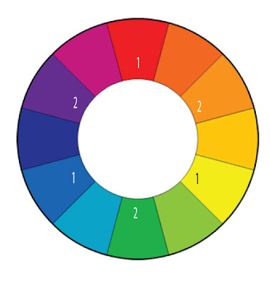
Red, Yellow and Blue are the primary colors. They are called primary colors because you cannot mix any other colors together to get these three.
Note: red, yellow and blue are primary colors for pigment. When you’re talking about color and light, the primaries are actually red, green and blue but that gets us into crazy physics stuff and I’m not going there.
Orange, Green and Purple are secondary colors. They are called secondary because you can make them by mixing only two primaries.
See the color wheel below for primary and secondary colors. Primaries are marked with a 1 and secondaries are marked with a 2.
 |
| Image Credit Tiger Color: Color Lab |
Opposites provide good contrast. Colors that are opposite each other on the color wheel are called complementary colors because they complement each other well and provide contrast. Each of the primary colors has a secondary color as its complement.
Color can set a mood. It can inspire a feeling or set the tone for a piece of writing. You can use individual colors or a color scheme to capture the essence of your story without words. Think of it as a wordless summary.
Characters are like colors. Often the best way to draw a character out is to pair it with someone completely opposite. If your character is best represented by a shade of purple, try pairing her with someone who’s a yellow and watch the sparks fly.
How I use color: When I develop a new character with an acrostic bio card, I tape a paint chip to the back of the card. The color becomes like a wordless bio for the character, telling me almost as much as the written bio on the other side of the card.
Homework: Field trip! Next weekend, take a half hour and go to a hardware store to browse the paint aisle. Most stores give out free paint chip samples so grab a few. No wait, grab a bunch. Try to find the perfect paint color to represent your character or your story. If you’re really ambitious, pick out colors for each of your important characters. See where the contrasts are, as well as the harmonious combinations.
If you’re really really ambitious, skip the paint store and browse a fabric store instead (where you can play with color as well as pattern and texture). If you don’t have time to browse the stores, break out the markers, colored pencils or better yet, paints! Mix and match and play with color. The point here is to have fun and to look at your characters and story in a new and different way.
What did you discover about your story by playing with color?


 Call me Gabi (pronounced gah-BEE). I'm a writer, freelance teacher, and a lover of books and words. I'm also the instigator of DIY MFA. iggi's my sidekick, but he thinks he's the brains behind this operation.
 Goodbye is for Sissies
 YA Cafe: What YA Book are You Thankful For?
 YA Cafe: Why I Love Dark YA
 YA Cafe: YA Appreciation Month
Comments on this post
LOVE this idea. I'm making big posters for all my main characters to hang above my desk. I will be adding paint chips to it now. I can already picture my main character's color — bright grey-blue.
And this also really makes me want to watch "The Village" again.
19. April - 1:39 pmFun idea! I love looking at paint swatches for home design stuff. I like the idea of giving your character a color that helps define him/her.
19. April - 3:05 pmHey there! I'm a new follower and absolutely love what I'm reading so far. 🙂 This is an awesome post, I love the idea of having colors symbolize different characters.
By the way, if you're interested at all I'm having an "Inanimation" blogfest in May, it'll be awesome!
http://xtheredangelx.blogspot.com/2011/04/100-followers-blogfest-inanimation.html
~TRA
19. April - 10:10 pmAwesome post! I was actually thinking about character colors a few days ago. I'm now extremely curious as to what colors my characters would be. I've always loved paint chips, there are so many gorgeous colors. 🙂
20. April - 12:31 amGreat post! Colors play a huge part for me. Thanks for the inspiration!
20. April - 9:54 amThis is a great reminder for us writers. I fall into the camp of sometimes forgetting good visuals for the sake of illustrative words. But the color matters. I like the paint store/paint chip idea too — it's a good challenge, and could lead to better writing. Thank you!
22. April - 12:46 amI have recently admitted and begun to indulge my love of colour and design. Although I'm living in a rented, fully furnished apartment for the next while I still love leafing through home magazines. I've heard of people doing story or character collages before which could be another way to apply colour.
A couple cool tools I've found online are Color Palette Generator that will generate a colour palette from an image. I also love Aviary which is a suite of free online design tools.
22. April - 2:25 pmI like this post. Colors are my life. As having synesthesia I see colors for names and numbers. Colors are fun and their effect on us is doubtlessly true.
26. April - 1:21 am