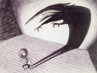
 Recently, I attended the Tim Burton Exhibit at the MOMA and was completely inspired. I am always pleased to see an exhibit where we get a look into the artist’s process as well as the final product. In particular, I love being able to get an inside look at the thought processes of such a creative individual like Tim Burton.
In addition, it is a very brave thing for an artist to put work on display that had once been simply rough scribbles of a creative mind. Many of the objects in this exhibit are things that were never intended for public viewing and I must say that I admire Burton’s guts in allowing us to see these personal early sketches. On a side note, I am also amazed that Burton saved so much of his stuff. There were sketches and papers that dated back to his days in high school. The fact that he has been such a meticulous archivist of his own work is what makes such a great exhibition possible. Not to seem presumptuous, but part of me muses: if there were ever to be a “Gabi retrospective” somewhere, would I even have the stuff to show? Most of my early work is either long gone or lost in the labyrinth that is storage. Seeing this exhibit makes me wish I had saved more work from my past. At the very least, it would be fun to look at it now and see how far my writing and artwork has come.
That said.
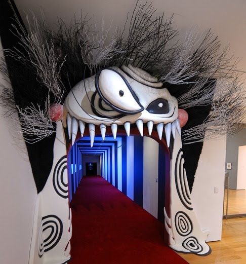
 As an exhibit, this one has some serious flaws. Let’s start with the first hallway. This hall (pictured left) is lined with television screens depicting Burton’s work along the left-hand wall. Problem: if people stop to watch one of the screens, it either blocks the flow of traffic or it means that other museum-goers must cross in front of them to pass through the hall. While the face sculpture above the entrance does make for a unique threshold into the world of the exhibit, the hallway does not work. I can understand the concept, if we were talking about an exhibit where people have to stand in line for hours to get inside. This exhibit, though, uses timed tickets to manage the crowd and the hallway occurs after the ticket taker’s stand anyway, meaning that all these TV screens do is block traffic.
The second problem is the obvious side effect of this exhibit being so popular. The exhibit is not designed with crowd control in mind. Many of the objects on display require getting up close to get a good look, which means if you get one or two people in front of a drawing or glass case, no one else can see. I realize that the nature of this collection makes this type of exhibit design somewhat inevitable, but come on, this is the MOMA. I’ve seen exhibits there that are much more effective in shuffling crowds through quickly and effectively. The space seemed small for the number of pieces on display and there wasn’t a clear path for the visitors to follow so they milled around, making the rooms feel more crowded than they would if the flow of people were more fluid.
Which brings me to my next point of critique: the signage was awful. I’ll admit right now that I’m not one of those museum-goers that reads every last little sign, but I like having some broad signage that signals:
- Which path I should take through the exhibit to best enjoy it,
- How the exhibit is organized, and
- Clear transitions between the different areas of the exhibit.
The only signage I found in this exhibit were a few that said things like “Surviving Burbank,” “Beautifying Burbank” and “Beyond Burbank” (written in an appropriately Tim Burton-esque font that I thought was quite nice.) I am not a fan of the “white box” theory of museum exhibits (i.e. paint a room white, throw some art on the walls and “let the art speak for itself.”) I think particularly in an exhibit like this where the art pieces have so much personality, it’s important to create a real “experience” for the visitors. The entrance sort of does this but after that the exhibit falls flat.

Finally, one of my main disappointments is that there is no exhibit brochure (or if there is, it was so poorly displayed that I couldn’t find it when I was there). I’m not talking about a catalog of the exhibit, but just a small brochure that each visitor can take home. I am reminded of the MOMA Exhibit called Safe: Design Takes on Risk which did an excellent job with a brochure that had a particularly clever design. This brochure both illustrated one of the main messages of the exhibit but also gave the viewer some basic information about the exhibit itself.
While brochures are by no means necessary at all exhibits, I feel that not having a brochure for this particular one is a missed opportunity. It wouldn’t need to be complex. The idea is that since Burton’s work really does “leap off the screen” and create an experience for his audience, it would be nice if this exhibit did that too, especially since the exhibit website is so fabulous. A simple brochure would help transition the visitors’ experience to beyond the walls of the exhibit itself.
 Overall, the material on display in this exhibit is phenomenal but the exhibit itself leaves much to be desired.
iggi says…

 The Exercises:









 Call me Gabi (pronounced gah-BEE). I'm a writer, freelance teacher, and a lover of books and words. I'm also the instigator of DIY MFA. iggi's my sidekick, but he thinks he's the brains behind this operation.
 Getting Through a Boring Day
 Writing Challenge: Week 2
 Little did Charlotte Bronte Know…
 Walking on Alligators by Susan Shaughnessy