Welcome Back to YA Cafe, where book lovers can gather and chat about teen literature. I’m your barista, along with Ghenet from All About Them Words.
Each Friday (Saturday this week, sorry!) we pick from a menu of topics and share our thoughts on our respective blogs. We’ve also got plans brewing for interviews, events and even some exciting giveaways, so stay tuned! Join the discussion by responding in the comments, on your own blogs or on twitter using the hash tag #yacafe.
Today’s Special: What covers do you love?
I’ll admit it, I’m quick to judge a book by its cover. If a book looks cheesy or too “teeny-boppery” from the cover, I’m likely to set it back on the shelf. I like high-concept covers. You know, covers that capture what the book is about without spelling it out completely. I love when designers use type in a clever way or play with photography. Not to mention, I love book covers that I can read on the subway without people wondering “why is she reading that weird book?”
But enough about what types of covers I love; today I’m going to talk about something I don’t love. I profoundly dislike it–dare I say, hate?–when perfectly good hardcover designs get replaced with schmaltzy paperback designs. Here’s what I mean: (hardcovers on the left, paperbacks on the right).
Isn’t this hardcover gorgeous? It makes me just want to peel that wax seal open and read the book. Also, small details on the cover link to elements of the story. (That basset hound embossed in the seal is there for a reason.) As the I read the story, I was delighted to notice the significance of these details.
Now check out the paperback redesign. It looks so blah, so generic compared to the hardcover. Sure, it’s got those shiny award stickers on it, but couldn’t they have put the stickers on the original and still used that design? Not to mention, talk about a cluttered design. I am not a fan.
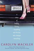
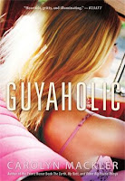 Lest you think the only reason I dislike some covers is because they have people on them, here’s an example of a hardcover-paperback pair where both show a person (in this case the protagonist). One works for me, one doesn’t. Take a wild guess which is which.
What I don’t like about the paperback is that we see a bit of the character’s face and hair. It leaves less room for the reader to imagine what that character looks like than does the hardcover. The hardcover, on the other hand, gives us some hints but doesn’t show us the character’s face so a lot is still left to the imagination.
In terms of layout, the hardcover is a much cleaner, tighter design. You can barely read the title on the paperback cover and the author’s name practically disappears. I might be going out on a limb here, but isn’t the whole point of the cover for readers to be able to recognize the book? If so, wouldn’t it be crucial for the title and author’s name to be readable?
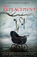
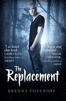 Of the covers I’m discussing today, this is the only one where I haven’t read the book yet. If I saw these two covers on the shelf side-by-side, I would definitely reach for the hardcover and wouldn’t even look twice at the paperback. I mean, how unbelievable is that hardcover? It’s so disturbing and haunting and shows me what the book is about without telling the whole story. It’s deliciously creepy!
The paper back, on the other hand… um, seriously? I don’t even know what to say because this cover is so opposite to the essence and core of the hardcover. All I know is that this looks generic and cheesy; this cover has no personality whatsoever. I actually had to double-check to make sure these were covers for the same book because when I first saw them, I thought they couldn’t possibly be telling the same story.
In the end, I don’t understand why publishers feel they have to change these gorgeous hardcovers and replace them with generic-looking mass-market-y designs. Wouldn’t it be an added cost to redesign a cover? (i.e. Investing more designer hours into the project, not to mention a possible photo shoot for new cover images.) If they already have a beautiful cover that works, why redesign it to make it uglier and less appealing? Or maybe these redesigns do have some appeal to teens–though I doubt it because teens are generally way smarter than adults and they wouldn’t fall for gimmicky bells and whistles like these. I’m really perplexed about this, so someone please explain it to me because I just don’t understand.
Still craving more YA-licious book covers? Fellow barista, Ghenet shares her thoughts on her blog: All About Them Words. Check it out, then tell us what covers you love!




 Call me Gabi (pronounced gah-BEE). I'm a writer, freelance teacher, and a lover of books and words. I'm also the instigator of DIY MFA. iggi's my sidekick, but he thinks he's the brains behind this operation.
 Goodbye is for Sissies
 YA Cafe: What YA Book are You Thankful For?
 YA Cafe: Why I Love Dark YA
 YA Cafe: YA Appreciation Month
Comments on this post
You raise an interesting question. Why do publishers feel the need to change the cover for the paperback edition of a title? I know not every book cover gets changed (I'm pretty sure I've seen examples where they stay the same). Hmm…
5. March - 4:36 pmInteresting. I guess I never realized they changed either. I'd love to know why. My favorite recent cover is ACROSS THE UNIVERSE by Beth Revis–it's just gorgeous.
5. March - 5:08 pmInteresting. I guess I thought the Replacement cover was for a different country and not just the paperback one. While I normally have a paperback only policy I am glad I broke that rule and bought the hardcover. It is the better image for sure.
5. March - 7:00 pmYou make a good point. I almost always like the original cover better. There's one occasion where I can somewhat understand a cover being changed, and that's when the book is on its way to theaters. Seems like a lot more people will grab a book when they see who'll be playing the characters right there on the cover. (But personally, even in those cases, I still usually prefer the original.)
Jessica
5. March - 7:20 pmLooks like the Replacement paperback cover might be for the UK version of the book. (Anyone out there know for sure? It's hard to tell from the interwebs.) Even so, I think the point still stands that the hardcover looks so much better!
Any other hardcover-paperback pairs you've noticed where the cover is different?
5. March - 8:13 pmI LOVE the hardback covers for the Replacement and Frankie, but I have to say I prefer the Guyaholic paperback – I think the hardback looks kind of yuppie/ Sex and the City naff, and also kind of like a non-fiction book. The paperback's not great, but I prefer it.
But I so agree with you, it's such a shame when beautiful, original, enticing covers get junked for blah, samey, 'Let's just stick a picture of a hot girl/guy on it' covers.
5. March - 10:02 pmICK! I hate the paperback cover for the Replacement, which I recently read and really liked and the cover was totally what attracted me to it in the first place! I think the outside of the book matches what's on the inside for so many different reasons. Plus the original cover stands out from everything else in YA section of the bookstore, and even when you compare it to most books in general.
This is almost as aggravating as really bad adaptations–which are official my arch nemeses.
But some books with covers I really love (and hope don't change when they go to paperback) are The Sisters Red by Pierce Jackson and Wither by Lauren DeStephano. Excellent stuff!
6. March - 5:57 pmEven the font they chose for the Replacement paperback is cheesy. Ick!Ick!Ick!
6. March - 6:00 pm